Pages

Showing posts with label My Work. Show all posts

Monday, 22 April 2013

Lord Whitney Brief

Just after Christmas our class was given a task of completing a brief by artists Lord Whitney. They came in for the day the brief us and I found it a really fun day which was very informative and helpful but also very enjoyable. They were really friendly and had some great advise and ideas. I took a lot at some of there work and was very impressed which it being really 3D, creative and entertaining. There brief was to make an illustration for a nonsense poem of a website which they gave us a link for. At first I was a bit apprehensive about this brief as I wasn't sure if my drawing skills were up to something like this as I have never illustrated a poem or story before. After looking on the website though I found the poems to be quite amusing and saw the fun side of the brief. I chose one about man building a ballon and looking at the moon, mainly because I have been looking at the sky and circular objects for my Major Project so I found it fitted in perfectly for me.

The poem I chose was:

There was an Old Man of the Hague,
Whose ideas were excessively vague,
He built a balloon,
To examine the moon,
That deluded Old Man of the Hague.

I drew a few balloons in my sketchbook and a moon to begin with (below) but I thought they needed a little bit more than just a black and white image...

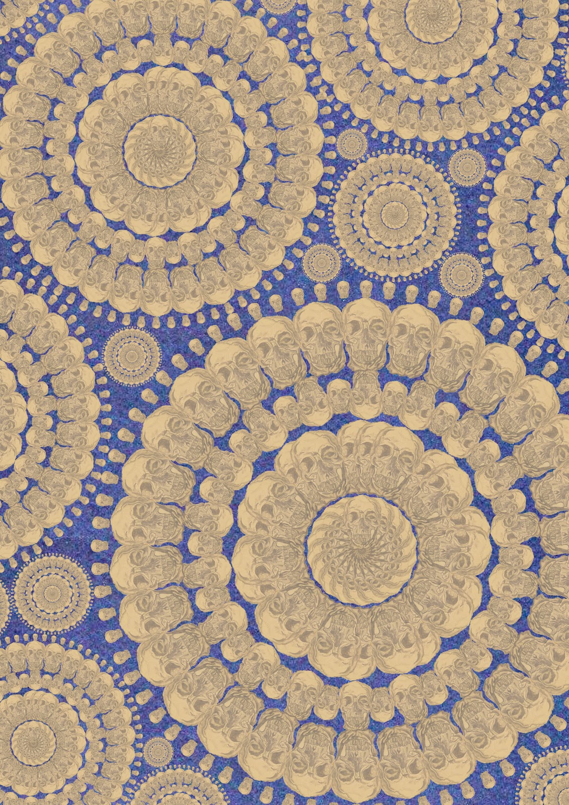
So I scanned them into Photoshop and made a rotated pattern around a moon and scanned in some backgrounds and papers and layers them all up to create a more illustrative pattern design.


Final design below.


Overall I was quite pleased with the end result and it was nice to have a break from our Major Project work and fun to try something new and work in a way which I haven't before.

They very kindly sent me an email back with some really helpful feedback :
"Hi Lyndsay

Thanks for sending through your response to the Nonsense brief,

How did you find the project? We loved your piece. It was really well thought out and the pattern, colours and textures work great on it we were really impressed.

Thank you so much for taking part in the brief. We really enjoyed working with you all and really hope you got something valuable out of it.

Good luck with your work,

Bek and Amy."

Thursday, 3 January 2013

Photoshop Experiments


 I have recently been trying to get to grips with using photoshop as I would like to use it more in my work this year. Here are some examples of some try out experiments with photographs, filters and my drawings. Hopefully the more I practise over the holidays the better I will get in time for my return to college!


Sunday, 2 September 2012

Summer Brief


Over the summer I was sent a brief where I could write my own proposal for the first time. This at first was a bit daunting for me as I struggle to make my own guide lines and pathways to follow, but after a while I saw it had a strong benefit of being able to pick something that I have always wanted to explore as an artist.

There were a few options that I could pick from as a rough guide line. The brief which I chose was:

Le Flaneur
Le Flâneur is a French word, which literally means the stroller, the dawdler, the loiterer but there is no true equivalent to the word in English. The flâneur appears to meander through the streets without plan or purpose. But this randomness is the flâneurs reason - to experience the life of the city by surrendering to its ebb and flow - the chance encounters and unexpected discoveries, which can only be revealed through the act of walking is what is recorded and noticed. Le Flâneur as a detached, yet engaged observer, Can you explore this of randomness and chance encounters in the city? What aspects of the city do you notice? Does anyone else notice it? What is hidden in the city but is not a secret at all?


I saw this as a good choice because I quite frequently find myself walking around Manchester city centre and noticing things that maybe others don't. I find myself drawn to buildings that look particularly urban or old buildings that are in distress and display decay. I see decay as an interesting visual thing and think there are lot's of possibilities, when doing some experimental work further into this project, which I could explore by distressing materials.
As a starting point I went to Manchester and took some photo's of buildings I like and things I found interesting e.g. decay, steps, bottles.  From these photo's I then began to draw some quick and detailed sketches. I have also done some collages and quick paintings of buildings. Some examples of these sketches and photo's are below. 


I am thinking of doing some collages of the photo's I have taken and merging things together to create a kind of photomontage of the things that interest me around Manchester. This is also a way of taking something like decay which some people will find an ugly thing and making it into something visually beautiful and interesting. I also find myself quite drawn to structures of buildings especially poles and frame work on buildings that are under construction or on bridges so I would like to include this in my work. I think I could make some interesting patterns for surface design from overlapping frame work.  I am excited to go on further with this project as I feel I have some good directions to follow and can't wait to experiment with materials. 


Thursday, 12 April 2012

Shapes & Colour


After spending some time on my drawings and colour experiments I decided to see how I can make the two combine to make some designs. I thought it would be a good idea to use my colour work as backgrounds behind my drawings so I started to play around with layering geometric shapes. I began overlapping shapes such as triangles, circles and squares because the designs I have been looking at, by artists such as Leif Podhajsky, have inspired me to use shape in my work. I think the shapes layered over the outbursts of colour work well together to produce a psychedelic trancelike illusion. As I have also drawn a lot of feathers I am thinking of using them in my designs by adding some colour and pattern to them. I think I could get some interesting effects if I scanned some of the feathers that I have collected along the way of this project and made them into patterns. I am now ready to experiment with these shapes and backgrounds on photoshop and illustrator to see if I can progress them into some designs for fashion prints. As I have based this work around hippies and looked a lot into festivals for inspiration I have decided that I would like my final designs to be for a young market for festival wear.